AI disclosure: this content, including any imagery, was artificially generated.
What the style borrows from painting
Watercolour tattoos imitate the way pigment behaves on wet paper. Soft washes bleed into one another. Splashes sit without hard edges. The tattoo design generator will render an idea this way if you want to see the effect on your own subject before a consultation.
Gradients shift from deep tone to almost nothing. There are few or no black outlines holding the shapes together.
That is the appeal. The style feels loose, expressive and light. A floral piece can look like a quick brush sketch rather than a stamped sticker. Abstract work can suggest movement and air.
But the very thing that makes the style beautiful is also what makes it fragile. Light colour without an anchoring line fades sooner. That is the honest trade-off, and you should know it before you book.
The watercolour tattoo trade-off, stated plainly
Traditional tattoos use bold black lines to define shapes. Those lines act like a fence. They keep the colour inside and give the eye something to read even when the fill softens over time.
Watercolour work removes the fence. Soft washes of colour sit directly in the skin. Over years, the body slowly breaks down ink particles.
Sun exposure speeds this up, and the NHS sun safety guidance is the short version of how to slow it down. Without a dark edge to hold the design together, the shapes can blur and lose definition faster than a lined tattoo would.
This is not a flaw in the artist’s skill. It is how skin and ink behave. A pale pink wash will never outlast a solid black outline. Anyone who claims otherwise is selling you something.
That said, the style is not doomed to disappear. Artists have developed ways to anchor the work so it ages far better than early examples did.
How artists anchor watercolour tattoos so they last
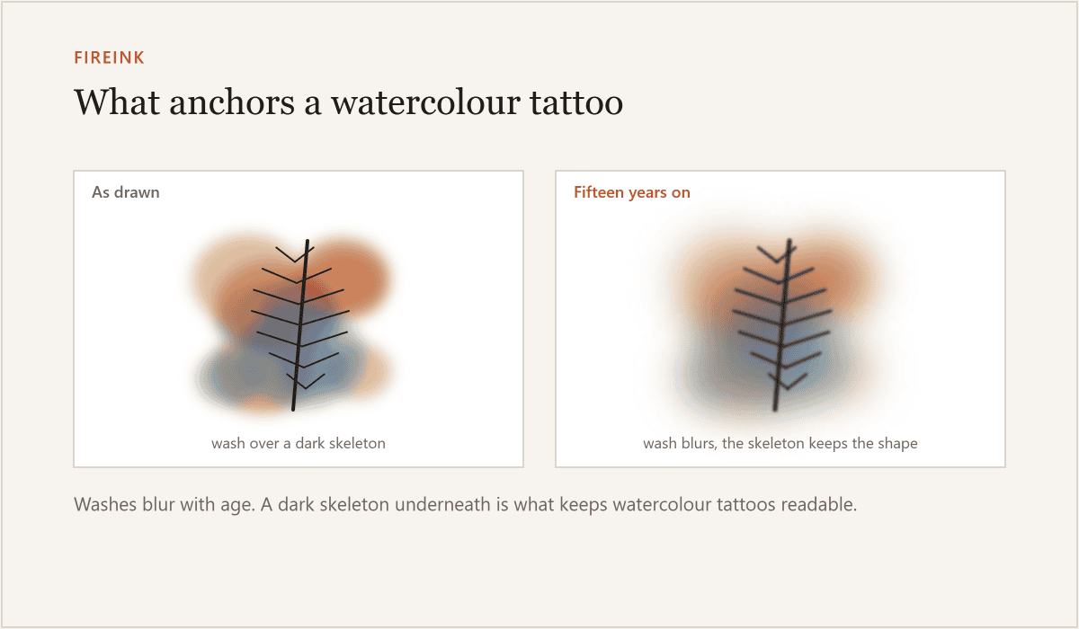
A skeleton of line or dark value underneath is what makes watercolour last. The best watercolour tattoos are not pure paint. They are built on a hidden structure.
Some artists use fine grey or black linework beneath the colour. Others place deep saturated tones at the base of each shape. The dark value does the same job as an outline, but it sits inside the design rather than around it. The colour can still bleed and splash at the edges, yet the core of the image stays readable.
Contrast does the heavy lifting. A watercolour piece with no dark areas at all will age into a faint smudge. A piece with a strong value range, from deep indigo to pale sky blue, keeps its legibility for much longer.
Ask your artist where the anchor points are. If they cannot point to them, walk away.
Colours that hold and colours that go
Pale and pastel pigments lift faster than saturated ones. That is the single most useful fact when planning a watercolour tattoo.
Soft lemon yellow, baby pink, lavender and mint green look lovely fresh. They also fade the quickest. The ink particles are simply less concentrated. Your immune system clears them more easily.
Deeper tones hold far better. Rich blues, purples, teals, magentas and dark greens stay visible for years. Black and dark grey are the most stable of all.
This does not mean you must avoid pale colours entirely. It means you should use them as accents, not as the main event. A wash of deep blue with a few pale highlights will age well. A whole tattoo of pastel yellow will not.
Sun exposure matters more for this style than most. UV light breaks down ink faster than almost anything else. A watercolour tattoo on a forearm that sees daily sun will fade noticeably within a few years. The same design on an upper thigh, rarely exposed, will hold far longer.
Sunscreen is not optional here. It is the difference between a five-year tattoo and a fifteen-year one.
Placement matters more here
Where you put a watercolour tattoo changes how it ages. High-friction areas wear ink down. Hands, feet, fingers and elbows shed skin cells constantly. Soft washes in those spots fade fast.
Areas with thin skin or frequent movement also struggle. Ribs, inner arms and the sides of the torso stretch and flex. That motion breaks up ink particles over time.
Stable, low-friction placements work best. Outer upper arms, thighs, calves and the upper back give the ink a quieter life. Less rubbing, less stretching, less sun if you cover up.
This is not about hiding the tattoo. It is about choosing a canvas that gives the style its best chance.
Vetting a watercolour tattoo portfolio
A portfolio should be judged on healed work, not fresh photographs. Fresh tattoos always look vivid. The ink is still sitting in the top layers of skin.
The colours pop. The edges look crisp.
Healed work tells the truth. Ask to see photos taken at least six months after the session. A year is better.
Look for how the washes have settled. Check whether the shapes still read clearly.
See if the anchor points are doing their job.
If an artist only shows fresh work, that is a red flag. Not proof of bad work, but a gap in the evidence. A confident watercolour artist will have healed examples to show you.
Bring reference images, but understand what they are. A reference design is a starting point to take to an artist. It is never “your tattoo” and never a claim about what will end up on skin. Your skin, your placement and your artist’s hand all change the result.
Good artists will tell you when a reference will not age well. Listen to them.
Want to see an idea with watercolour washes before you commit to them? The tattoo design generator has a watercolour style and draws it in 30 to 60 seconds — free, no signup, nothing uploaded. Take the result to an artist as a starting point.
FAQ
Do watercolour tattoos hurt more than regular tattoos?
No. The pain depends on placement and your own tolerance, not the style. The needle works the same way.
Can you get a watercolour tattoo covered up later?
Yes, but it is harder than covering a lined tattoo. The soft edges and pale tones give less to work with. A skilled cover-up artist can still manage it, often with a larger, darker design.
How long before a watercolour tattoo needs touching up?
Most people see noticeable softening within three to five years. A touch-up can restore some vibrancy, but it will not bring back what the skin has fully cleared. Plan for maintenance.
Are watercolour tattoos safe for all skin tones?
Yes, but contrast matters more on deeper skin tones. Pale pastels show less clearly. An artist experienced with your skin tone will adjust the value range so the design still reads.
Is the style suitable for text or lettering?
Rarely. Lettering needs crisp edges to stay legible. Watercolour’s soft washes work against that. If you want words, choose a lined style.